Project Overview
Problem:
We are living in a technologically saturated, fast-paced working culture with jobs that require workers to wear many hats at once and to adapt almost immediately to new subject material.
Fewer and fewer people are going into industries they went to university for, adding another stressor into the equation. The majority of vocabulary apps out there are designed for standardized test prep and not for the working world.
Professionals need a resource they can use to quickly learn terms and concepts related to their field of work.
Solution:
Moby is an app that revolves around flexibility in learning. The lessons will be centered around relevant, real-life situations that the users can gain context from and provide a resource that isn't just dedicated to higher education.
Whether that means customized goal settings, custom flash cards, or learning by activities, I want the app to fit the needs of a user who learns as they go.
Project Plan:
Timeline: 30 Days
My Role: UX Designer
Tasks: Concept Development, Competitor Analysis, User Research, Wireframing, Prototyping, User Testing, UX Design
Tools: Balsamiq, Adobe XD, Marvelapp, Google form, Power Point
Research
Competitor Analysis:
I needed to understand what the industry considered an effective vocabulary learning app and the elements that made it successful. To do so, I looked into three vocabulary apps that each provided a specific service when it came to helping the user study.
I also compared how they showcased features, the overall organization of each app, and looked to see for any opportunities I could add to my own.
Company & Product Findings:
Each of these apps approached learning vocabulary with varied methods. Subject material ranged from niche idioms from the English language to standard exam vocabulary.
And yet, there still seemed to be a disconnect between simply memorizing what was on the page versus actually understanding it.
This shows to me that there has yet to be a studying method perfected to help people retain knowledge faster. From a UX Perspective, this means my goal should be to create an app where engagement is the top priority.
UX Findings:
The only app that really succeeded in trying to make the learning experience fun was Idioms. Vocabulary Builder was very cut-and-dry, relying mostly on words matching and flashcards for studying.
Vocabulary: Learn New Words had neither, sacrificing more complex interaction for a more simplistic approach to learning with one word a day.
A big annoyance was limited function in some due to not paying a subscription. I recommend gaining revenue through ads with the option to forego them with a subscription, mainly to give the user a choice in how they want to view their content.
Biggest takeaway: Moby needs to be an app that provides relevant, real life context to its lessons, have the option to import terms for customized studying, and be engaging/fun enough for the user to keep wanting to interact with it.
User Persona
User Interviews:
I interviewed three professionals in the age range of 18-34 who all revealed that their current job is not in the field they went to school for.
My questions centered around what kind of learner they were, their preferred methods of studying, and their frustrations with existing education apps.
Biggest Takeaways:
—Most preferred learning new vocabulary through interactive games/activities
—Visual distinction and a clean layout is very important in an app
—The user wants to set the pace in which they learn on the app
—Real-life examples are preferred when learning new terms
—Most feel discouraged when the method of learning provided to them by the app isn't one that works for them
User Persona:
Interviewees were selected with specific characteristics in mind. As a result, a user persona was created to represent their thoughts and make it easier to understand their wishes and frustrations.
Design
Task Flow Analysis:
To get a better idea of how I wanted the app to be organized, now was to identify two key features to include in our app that our persona, Nicole, would be most likely to use. The goal was to create a working prototype displayed in an easy-to-read flow map.
Here are two step-by-step breakdowns processes Nicole will actually go through when completing tasks through the app.
Task: Access Previously Learned Words in Library
Entry Point: Open App
Success Criteria: Able to access a previously learned term
•Open App
•Sign In
•Home Screen
•Select Library Icon
•Select Past Lesson within Library
•Scroll or Search to Find Word
•Select Word
•Optional: Revisit Lesson
•Exit to Go Back to Dashboard
Task: Learn Vocabulary in Context of a
Specific/Relevant Scenario
Entry Point: Open App
Success Criteria: Completing Exercise and Returning to Home screen/Dashboard
•Open App
•Sign In/Sign Up
•Home Screen
•Select Activity
•Select Desired Scenario
•Select Level of Difficulty
•Complete Exercise
•View Results
•Highlight Terms to Revisit
•Exit to Go Back to Dashboard
Now I had a clearer picture on how I wanted the app to be organized. Creating task flows helps prioritize features and show the optimal navigation hierarchy for the app.
For the completed Moby prototype, I ended up creating an additional two tasks, totaling in four for subjects to complete in user testing.
Wireframes:
What will these tasks look like translated to a screen? That's where wireframing comes in.
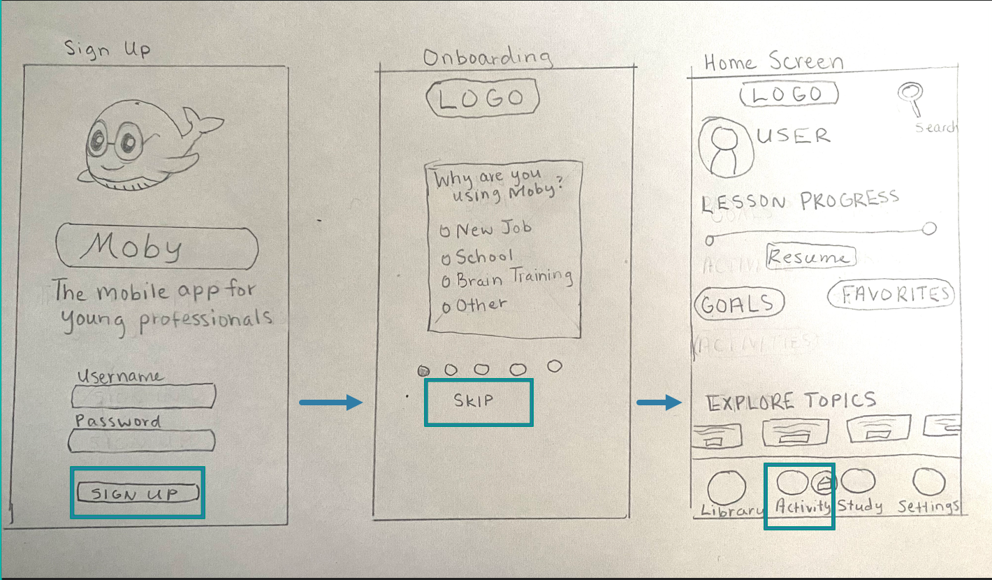
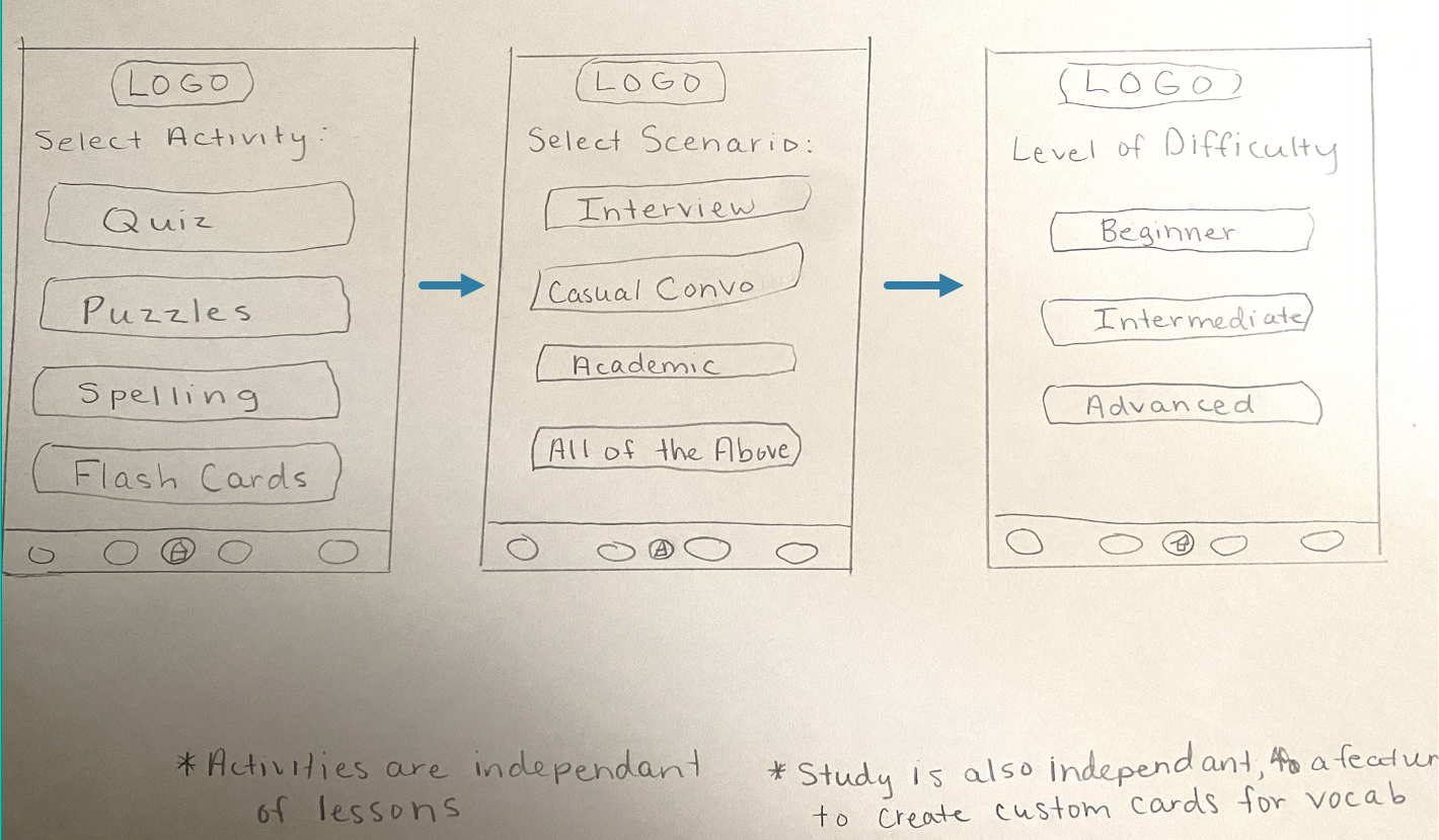
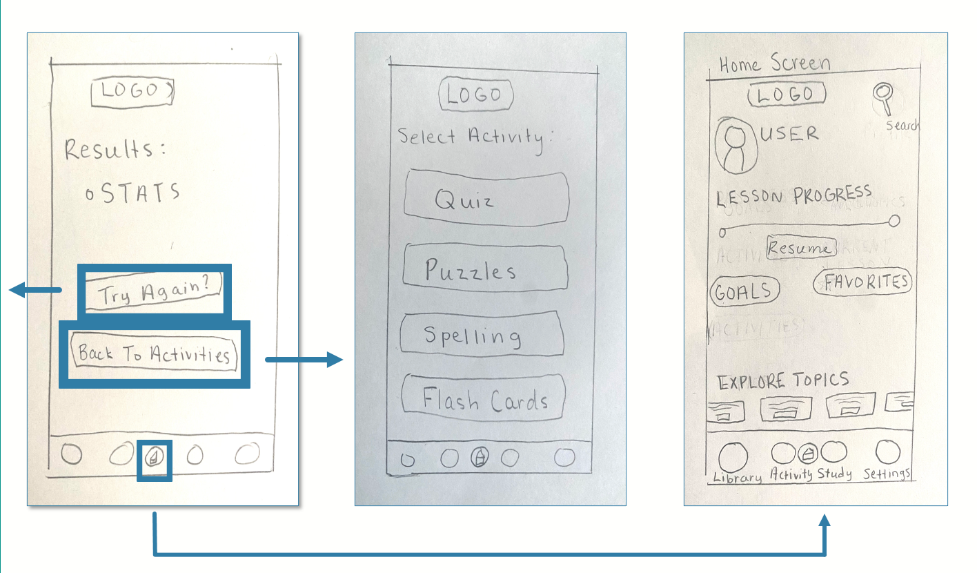
First, I sketched out low-fidelity wireframes on paper focusing on the navigation hierarchy and critical app functions to target users.
We'll be looking at this process through the Task: Learn Vocabulary in Context of a Specific/Relevant Scenario


Using the software Balsamiq, I then created these mid-fidelity wireframes to gain a better sense of the spatial awareness and navigation aspect of the app.
This stage was about perfecting the task flow before presenting it to users for testing.
Evaluation
Prototype Evaluation and User Testing:
I scheduled three sessions with three separate participants to test out my prototype. The goal was to observe how real-life people interacted with the app and document any vital information that could be used to improve the experience.
For a closer look at the process, check out the User Test Overview and the Moby Prototype used.
Findings and Observations:
Pain Points:
—The Placement of the Sign Up vs Sign In buttons were not clear enough to easily differentiate
—There was confusion in where to go to reset Goals
—Users could not locate the correct button to press for Task 3, Import Study Cards
Key Takeaways:
—Button labels needed to be clearer for navigation
—Task flows were streamlined correctly and left little room for confusion
—Participants enjoyed the questions in the onboarding section
Lessons Learned and Next Steps:
The UX Design process is a never ending cycle of designing, testing, adjusting, and repeating until you reach your desired outcome. While some may see this as daunting, I see it as endless opportunities to craft my product into something I'm genuinely proud of.
With that in mind—after incorporating the feedback into the next round of prototyping, the process for this project going forward will look like:
•Test the improved prototype
•Begin expansion on more complex user journeys
•Continue making appropriate adjustments until the product is ready for high-fidelity prototyping
The project's ultimate goal in the next stage of production is to provide more interactive screens that the participant would be able to use as if they were on a real app trying to complete a task. For that to happen, UI and visual design elements would be introduced as well.