Project Overview
As I was deciding what type of app I wanted to develop for my certification course, I wanted to tackle something prevalent and yet not given nearly enough attention.
Financial literacy in younger generations is at an all time low, and as a result, the generational wealth gap keeps growing.
My solution? Design an app that provides young professionals with a financial education app that uses an intuitive and easy-to-understand approach.
Timeline: January 2021 - June 2021
My Role: UX Designer
Tasks: Concept Development, Competitor Analysis, User Research, Wireframing, Prototyping, User Testing, UX/UI Design
Tools: AdobeXD, Balsamiq, Adobe Photoshop, Usability Hub, Optimal Workshop, Google Form, Zoom
An important note: For the sake of scope and time, the app's reach will primarily be centered around the United States stock market and its citizens financial culture.
The Design Process
To create the Quarter app, I followed the Design Thinking process as the foundation with applying Agile methodology for a user-centered approach.
This iterative process allowed me the flexibility to redefine problems from users' perspectives and find alternative solutions to address the evolution of the users' needs.
Empathize
1. Problem Statement
After gathering more research through user interviews, I realized the main interest users had in the app were more educational than application.
As a result, while the overall design of the app didn't change, the focus of it did.
Takeaways: It's crucial to have a strong problem statement to build on as you start brainstorming business requirements and possible user stories.
2. Competitive Analysis
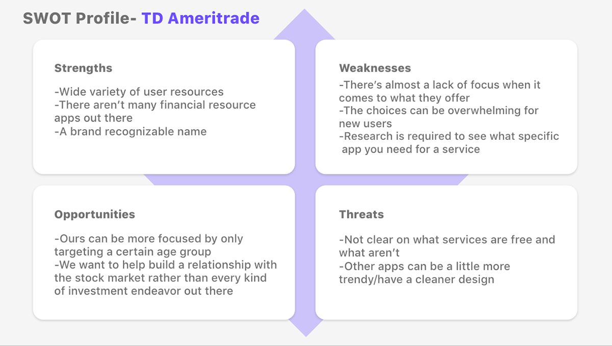
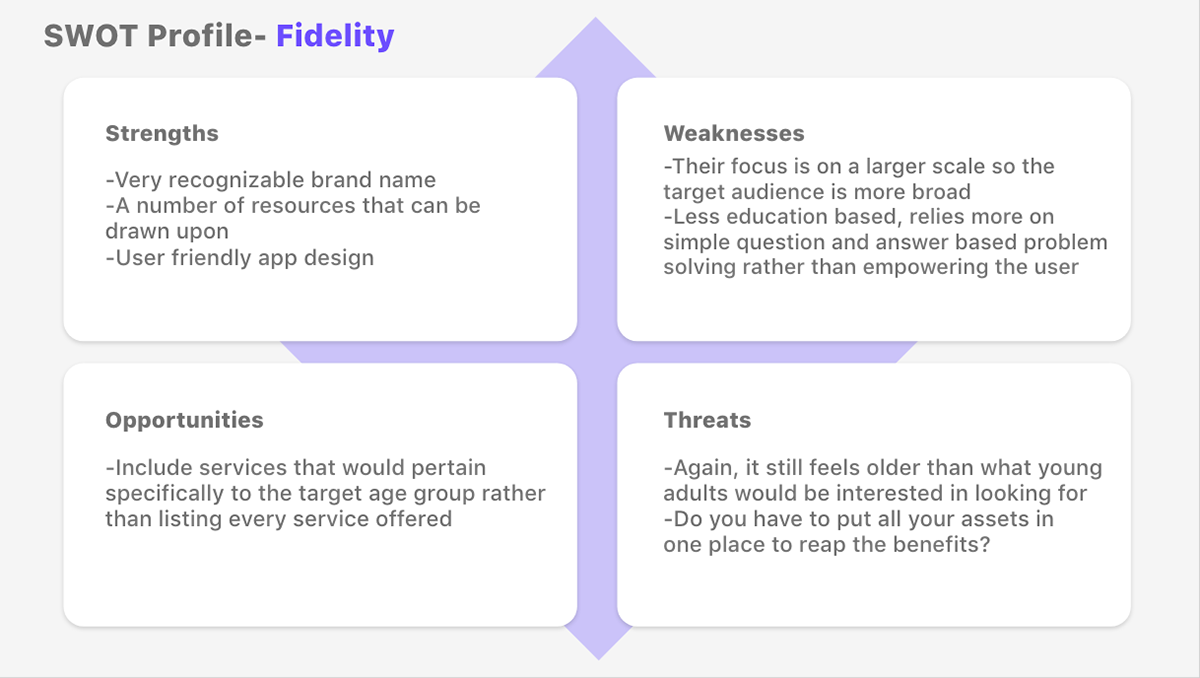
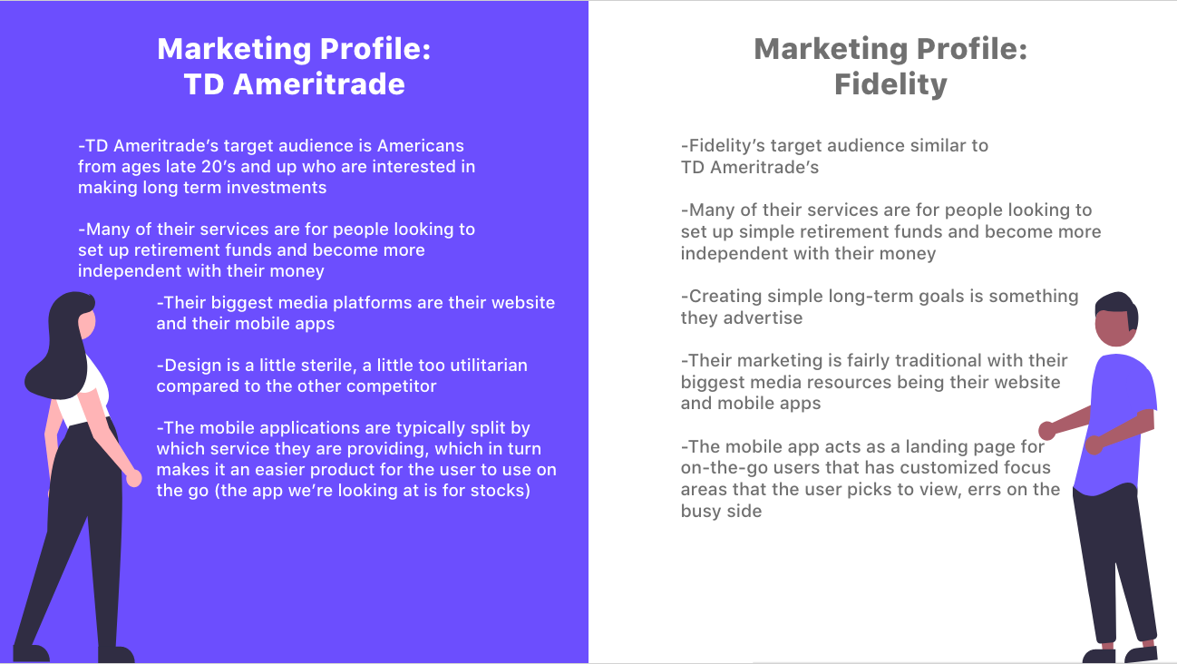
To get a better idea of the existing financial service apps in the market, I chose to analyze two of the most highly rated ones: TD Ameritrade and Fidelity.
Key Insights:
—These apps are created with the goal to have the user put their money in the app rather than taking the time to teach them the Why behind it
—Both apps had busy layouts that made it hard at times to navigate
—The education tabs were too wordy and used hard-to-understand language
—Not much responsive design, they just felt like condensed versions of their websites
—People preferred profile-centric apps that centered the UX around them
Takeaways: Their focus audience was too broad and they weren't interested in refining their interface to appeal to younger, more tech-savvy users.
3.1 User Research
Now was the time to really nail down goals and pain points to set as the foundation for developing User Personas.
Research Goals:
1. Understand the general finance knowledge of target audience and what drives them to use personal finance apps
2. Gain insight on what makes user hesitant to engage in personal finance
3. Understand what makes a utility app attractive (UX/UI elements) and what makes it unattractive
Questions discussed in User Interviews
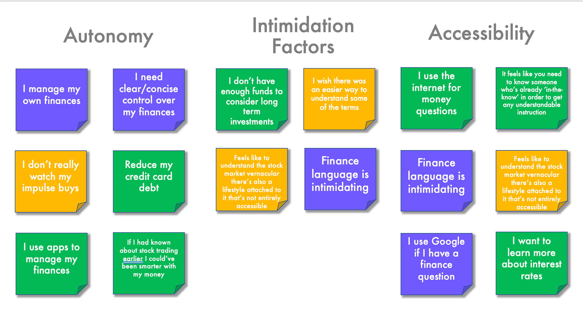
3.2 Affinity Mapping
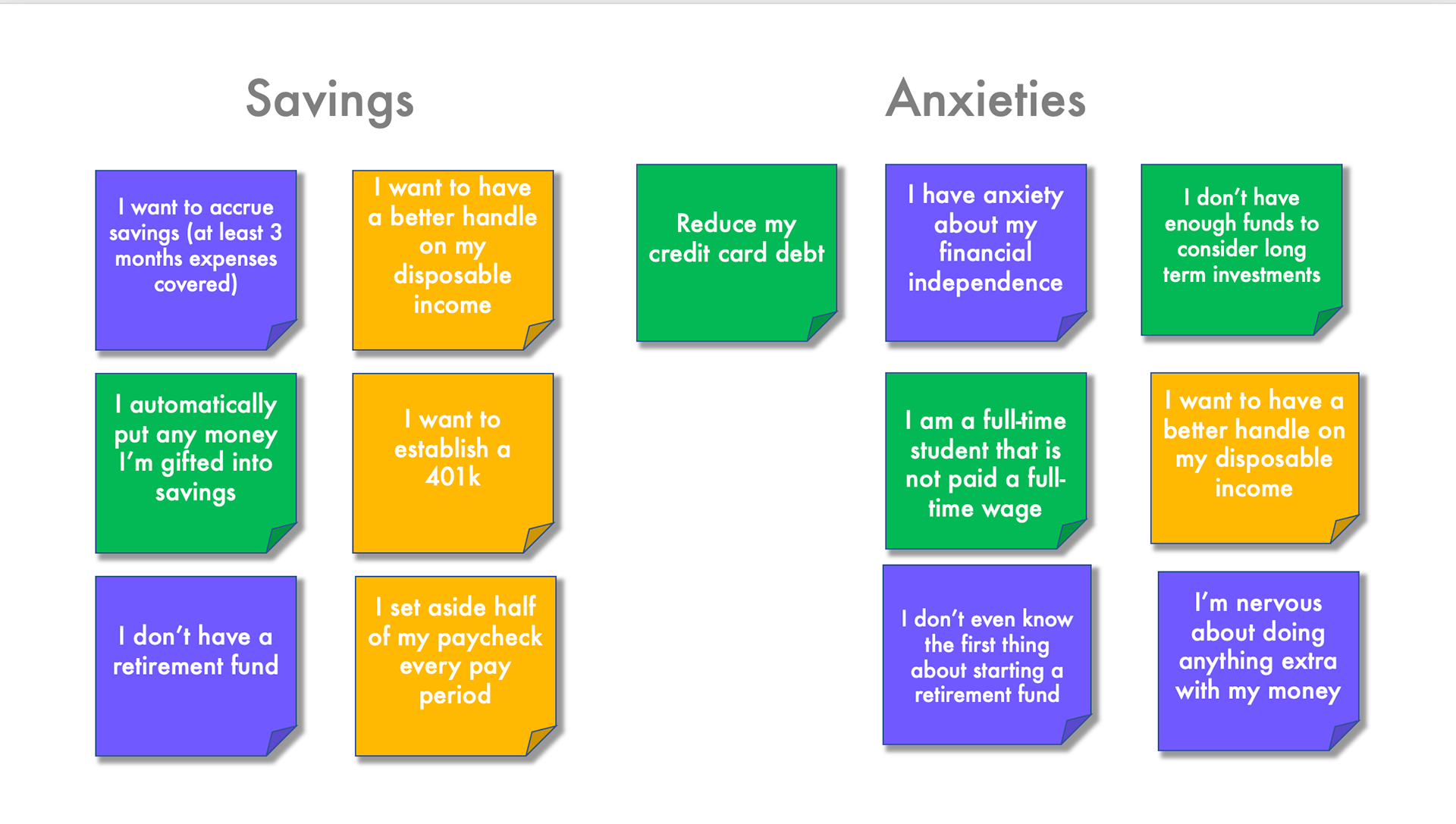
Now pain points and user motivations could be easily identified.
Key Insights:
—100% of participants have goals revolving around establishing financial security/stability
—100% of participants mentioned something along the lines of the language surrounding finance to be intimidating or inaccessible
—100% of participants expressed wanting to build confidence with how they deal with their finances
—100% of participants did not have a singular resource they went to for financial education
Takeaways: In order to have an app that met the needs of the people we wanted using it, we needed to shift to a more education-based focus rather than application.
Define
4.1 User Personas
After compiling the information I learned from my previous research, I created these personas to represent different targeted groups with needs and goals that fit the need to use Quarter.
This way I can make user-centered design decisions using data from real individuals.
4.2 User Journey Maps
With these personas in mind, I then created user journey maps for a more in-depth understanding of users' goals and the context of app uses.
These journey maps focus on visualizing users’ mental models (needs, thoughts, behaviors, feelings) when they try to complete tasks and achieve their goals.
4.3 User Task Flows
From a more technical aspect, here's a step-by-step breakdown of the process user's will actually go through when completing a task through the app.
Takeaways: This step is the most helpful when planning out the app's navigation hierarchy.
Ideate
5. Sitemap
As I entered to phase to begin designing the Information Architecture of the app, I drafted an initial sitemap that laid out the groundwork for the overall layout.
To test the effectiveness of the hierarchies, I created 30 cards using key words and conducted an open card sorting using Optimal Sort found here.
This gave me a clearer idea on how to organize where to put what feature when revising my drafted sitemap. Below is the finished version.
Prototype
6.1 Low-Fidelity Wireframes
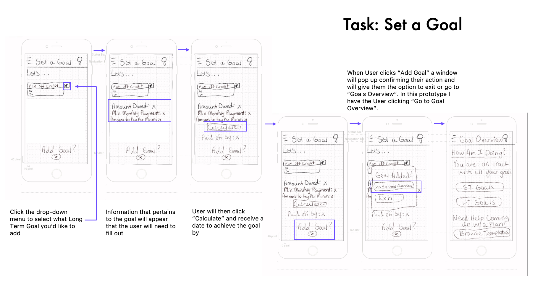
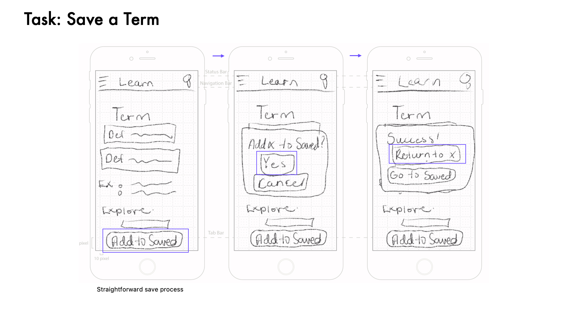
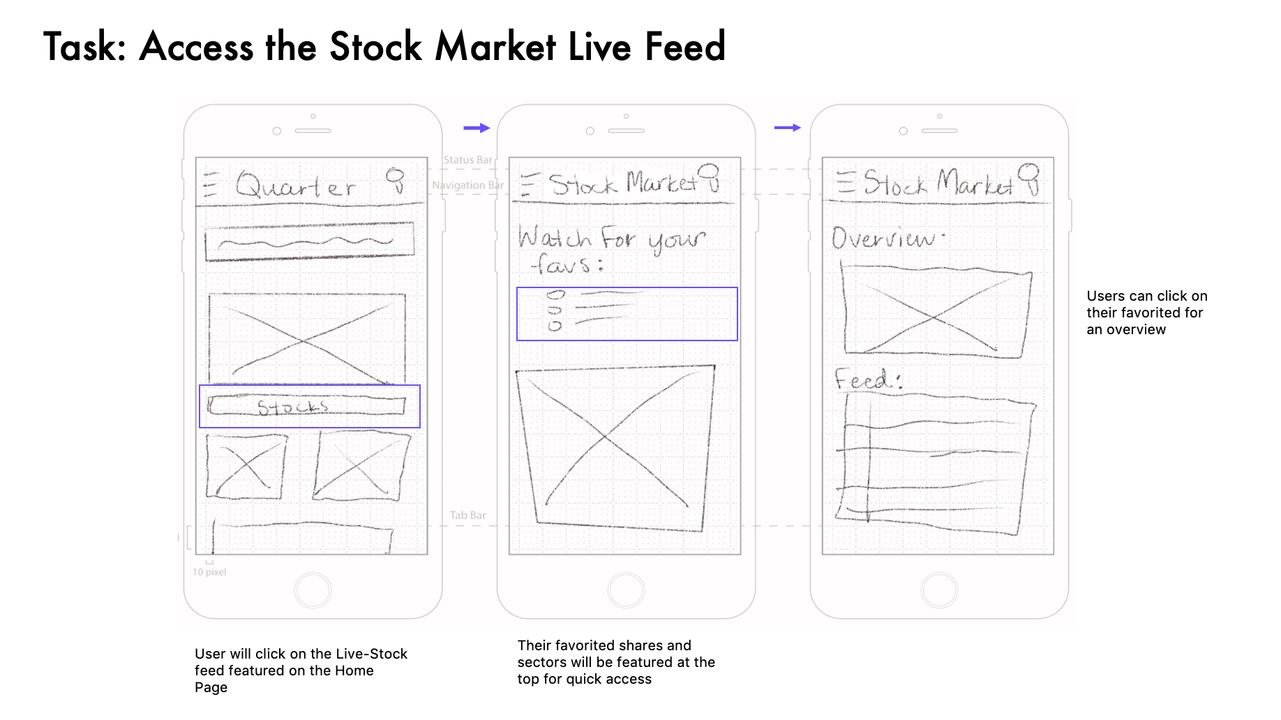
First, I sketched out low-fidelity wireframes on paper focusing on the navigation hierarchy and critical app functions to target users.
This is a quick, effective way to brainstorm multiple options before moving on to polishing the task.
6.2 Mid-Fidelity Wireframes
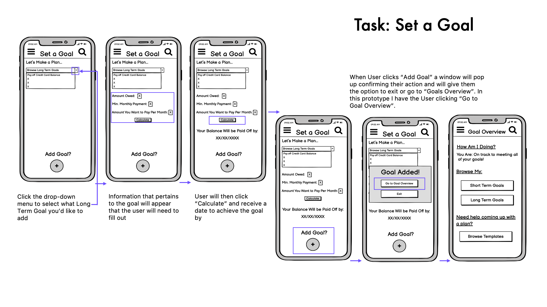
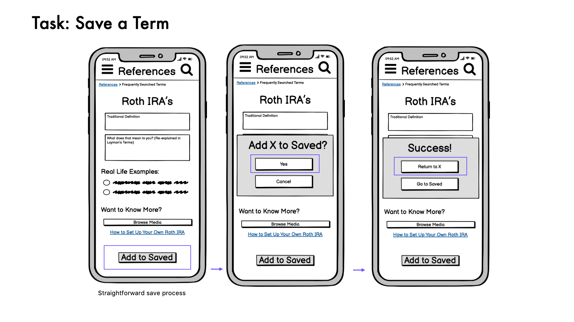
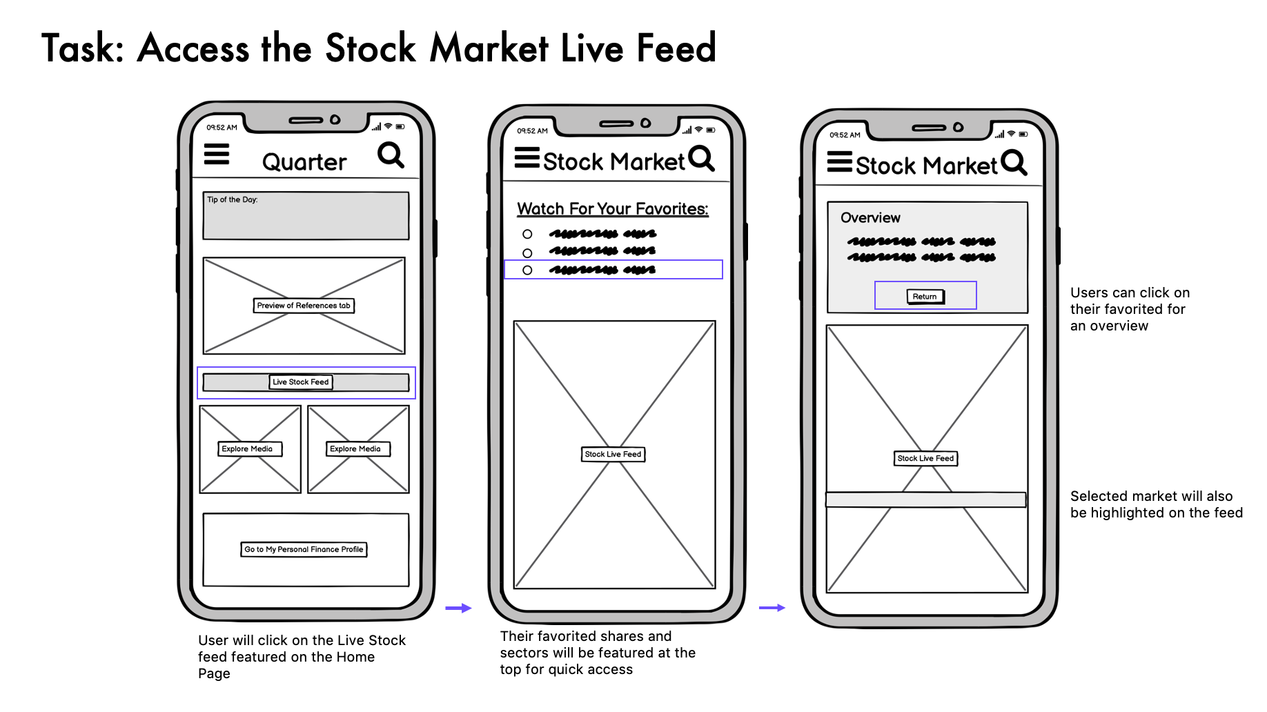
Using the software Balsamiq, I then created these mid-fidelity wireframes to gain a better sense of the spatial awareness and navigation aspect of the app.
This stage was about perfecting the task flow.
6.3 High-Fidelity Wireframes (Pre-User Testing)
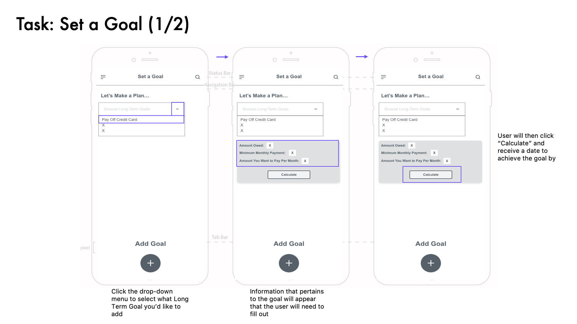
I finally built my high-fidelity wireframes that I would be presenting to participants for user testing.
I used AdobeXD to create more interactive prototype screens that the participant would be able to use as if they were on a real app trying to complete a task.
Important Note: The app undergoes a bit of a makeover after analyzing the feedback from the user testing and reworking the UI to fit the iOS User Interface Guidelines. This will be expanded on in the Iterate stage.

Test
7. User Testing
The goal was to observe how real-life people interacted with the app and document any vital information that could be used to improve the experience.
To streamline the process, I create a Usability Test Plan and drafted out a Test Script for consistency in the sessions.
The testing involved 6 remote moderated sessions via Zoom, using screen sharing and recording.
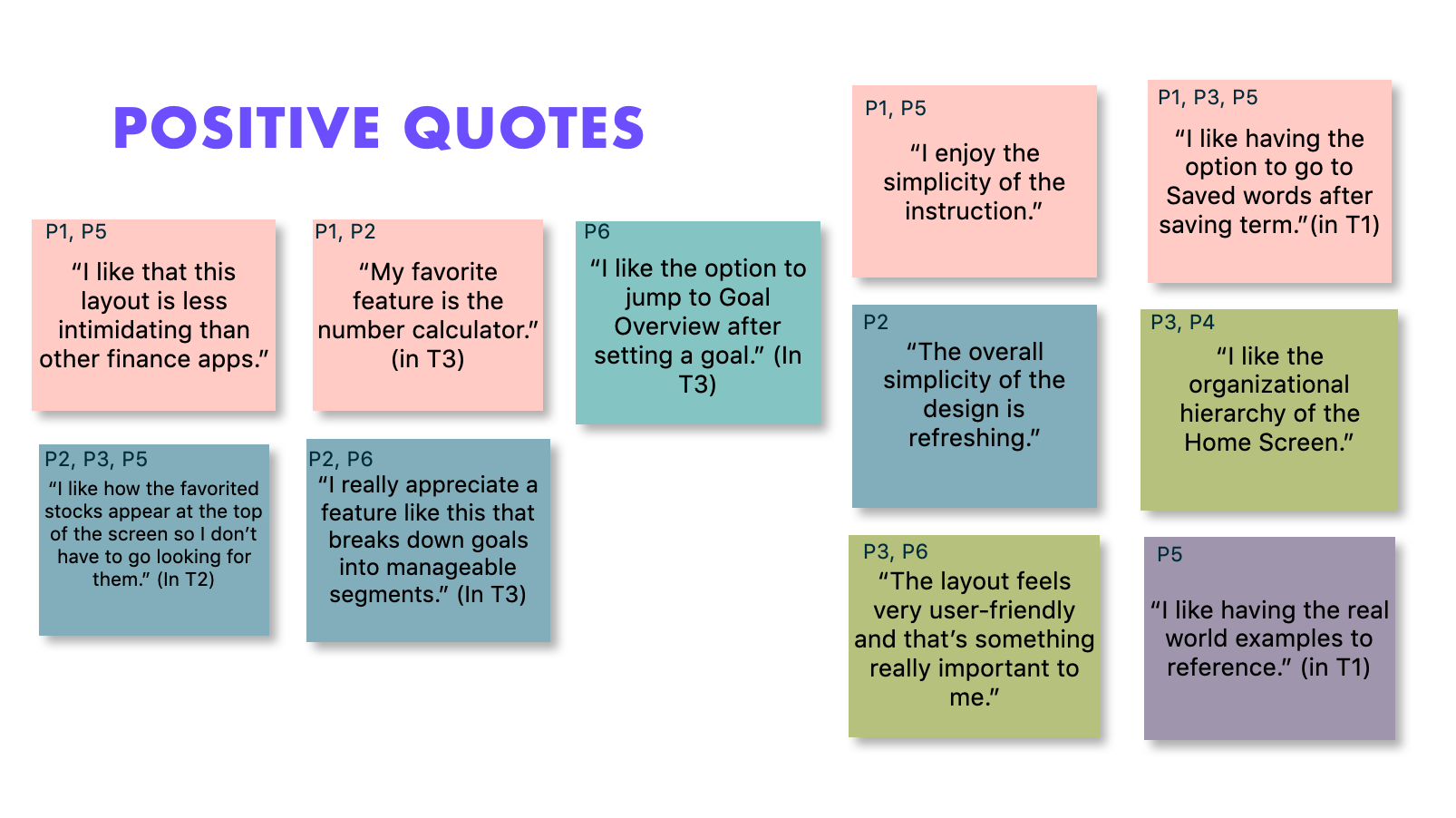
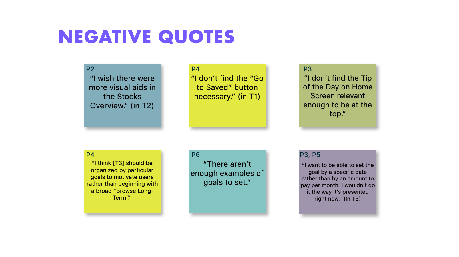
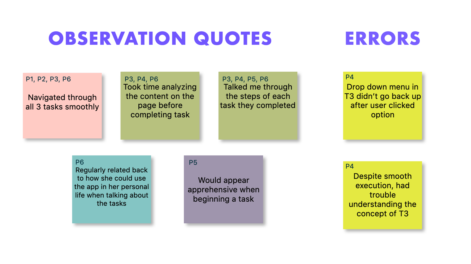
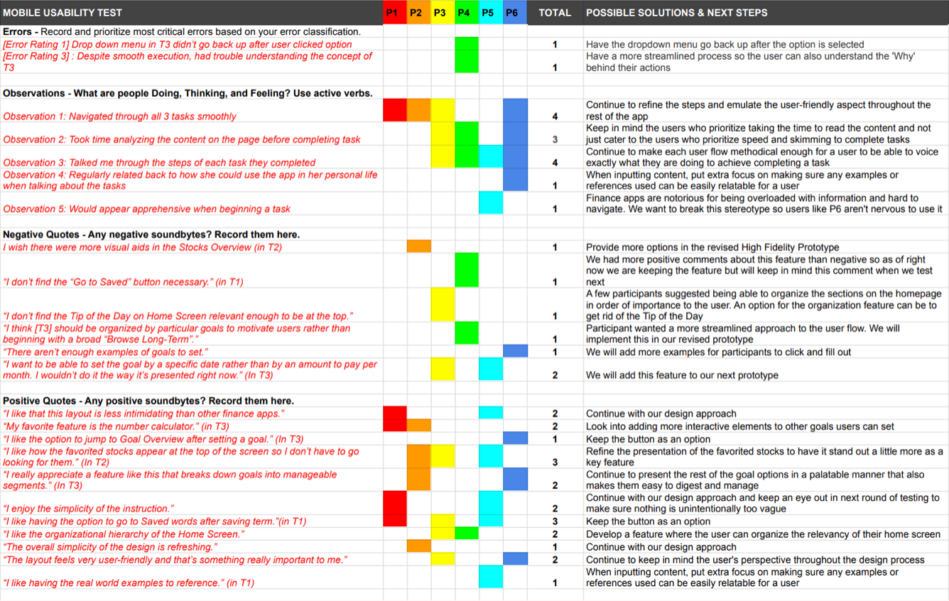
I analyzed the results by organizing key observations via affinity mapping and a rainbow spreadsheet.
Top Issues and Biggest Takeaways:
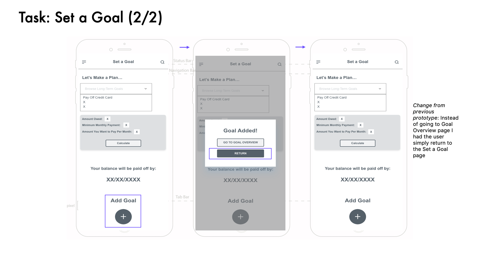
—Mechanics needed to be smoother in the Set a Goal Task, specifically the drop-down menu (Low-Severity)
—Confusion at the process for the Set a Goal Task, only completed it through context clues (Mid-Severity)
—Multiple requests to have the option of knowing how much to pay by when included in the Set a Goal Task (Mid-Severity)
—4/6 participants expressed excitement for future stages of completion for design and that even in testing they felt more confident in their abilities after completing tasks
Iterate
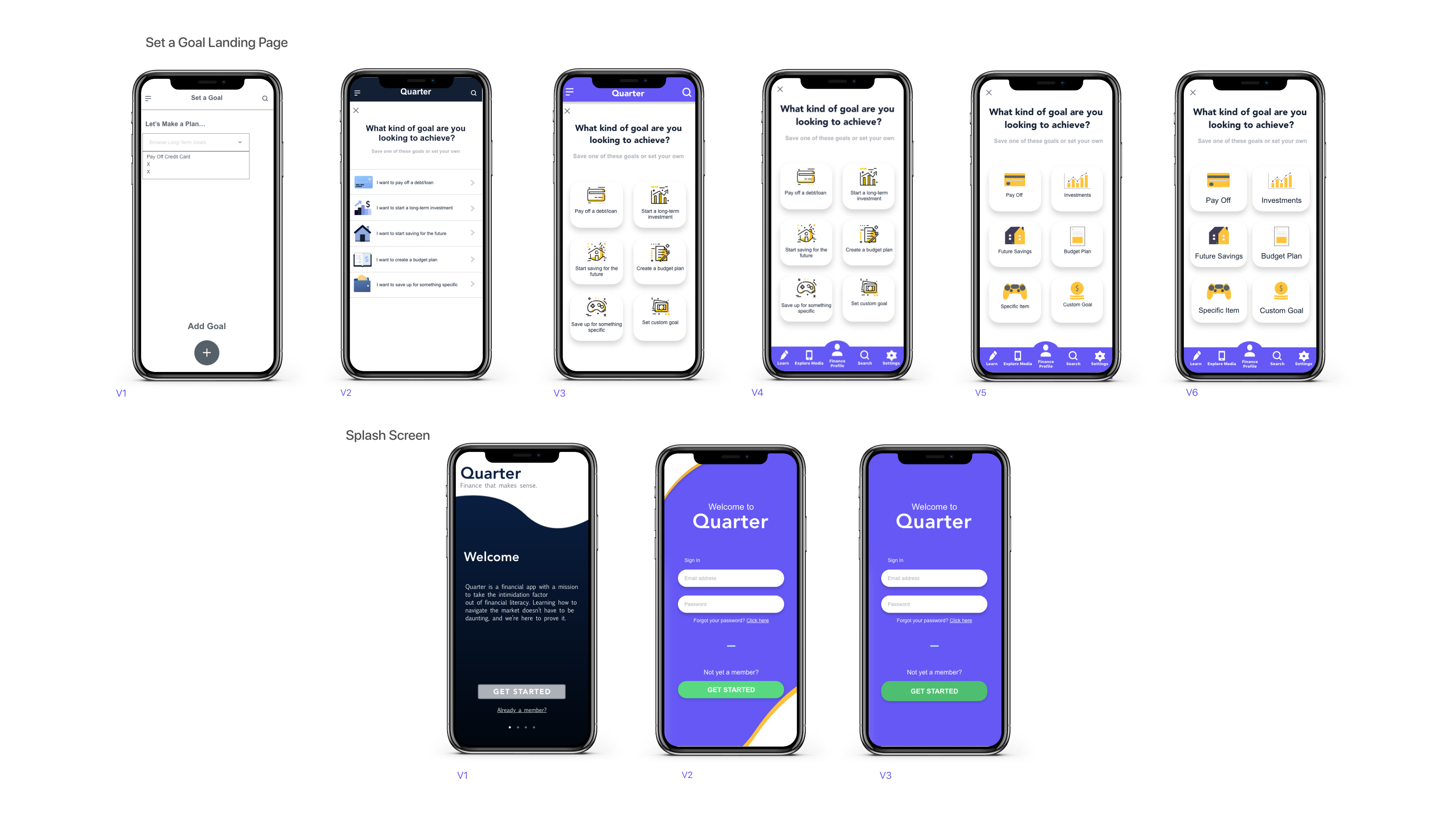
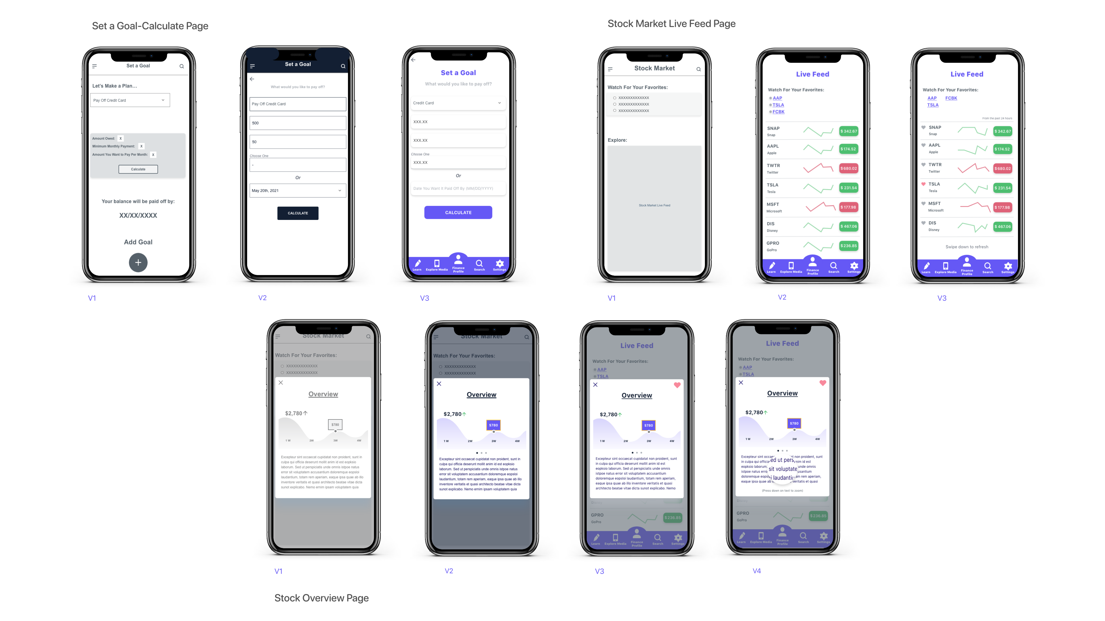
8.1 Polishing the Design
Now that I had proper feedback from user testing, I knew what changes I had to make to the prototype before diving into refining the overall design of the app.
As we incorporated visual design elements into the design, this is where we see the biggest transformation of the project.
Design elements incorporated:
—Gestalt Design Principles
—Principles of Design
—iOS Human Interface Guidelines
The Set a Goal Landing Page went through the most-intensive design process.
You can see where the iOS Human Interface Guidelines came into play from the new location of the navigation bar and in the simplification of the layout.
8.2 Designing for Accessibility
Your app must be versatile and anticipate any potential obstacles a user could have that would make using your app an unpleasant experience.
To the left is a slider comparison of Quarter's standard Light Mode vs a Dark Mode conceptualized for those with sensitive eyesight.
9. Final Prototype Mockup
Design, test, iterate, repeat. After incorporating all the feedback and design elements into our prototype's revisions, we finally have a mockup that reflects what the Quarter app experience should feel like.
Below is a video taking you through the interactive, high-fidelity tasks user's were asked to complete in testing.
As a reminder, these tasks are:
1. Set a Goal to Pay Off Your Credit Card
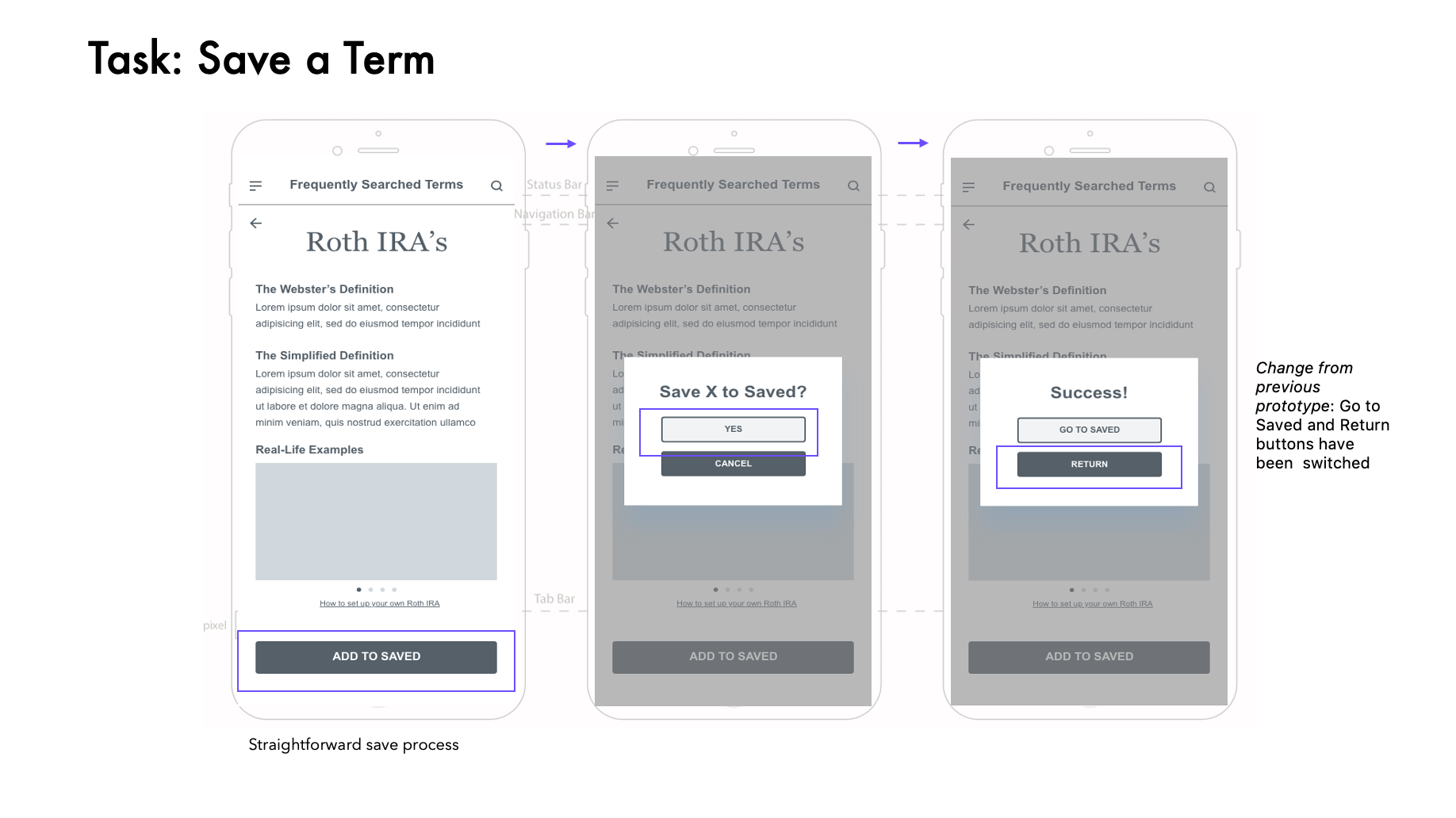
2. Save a Term
3. Access the Live-Stock Market Feed and Click on One of Your Favorited Stocks
10. UI Style Guide
It's important to document the final design so that it can be shared with stakeholders (designers, developers, Product Manager).
So, I create a Design Style Guide to standardize my design and make it reusable.
Final Thoughts and Credits
Congratulations for making it to the end of this page! The UX Design process truly is a never ending cycle of designing, testing, adjusting, and repeating until you reach your desired outcome. While it can come off as a daunting endeavor, the benefits you reap once you embrace the process far outweigh the time and effort it takes to get there.
This project was apart of the CareerFoundry UX Design course and I'd like to thank my mentor, Ayaz Memon, and my tutor, Tasha Salgado for their insight and guidance.
Thanks for viewing!